Last week Layla Grayce was kind enough to help suggest what our first office piece should be. The screen has just arrived- but the office, still pretty empty. This week m Minhee at Paper Cup design helps us choose the new office labels.
Here are a few Minhee and I like- please help us choose which wrap-around labels to use by commenting on which you think looks the best? (Read the notes below- I hope you are all visual people!!! )
Cream trim, signature in Metallic gold, black letters, Papaya envelope
Address will be written in black.
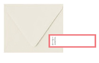
Cream envelope, white labels trimmed in gray, gold signature, black letters.
Address would be written in Papaya or hot pink!
Cream envelope, double trimmed coral on a white label , sig and letters in black.
Address would additionally be in black.
cream envelope, bright papaya/pink trim, gold signature , black letters.
Address would be written in gold. Possibly a matching gold liner?


20 comments:
I like the one with the papaya envelope. It really stands out and is such a beautiful colour, but it's really nice and elegant too.
I think I love option 2! The gold signature would pop against subtle color/details!
I THINK my favs are #2 and #4....
I think.
My favorite is #1 - seems the most distinctive. But if you want to go more classic, #4 would be my choice.
I love the second option! The gold signature with gray border is the perfect mix of glamour and sophisticated style!
For me is a tie between the 1st one and the 3rd one!
~M
Classy & Fabulous
My vote goes to #4.
While I like #2 very much (#1 and #3 look a bit heavy to me), #4 has the same classic look that I appreciate in #2 but the pink adds a touch of personality.
I love the gold + pink + black. I think it would also work to have a very dark grey in place of black.
i just keep coming back to option #1. the envelope is just so eye catching.
My initial reaction was #1 because it was more bold, but on closer inspection my vote is #2-classic and pretty!
No. 4 is my favorite!! Classic and elegant, with a punch of color! D-I-V-I-N-E.
I love, love 3 & 4. That shade is delicious and would look stunning with gold. The envelope would be gorgeous with papaya lining.
Really love the cream envelope with the coral trim (or the papaya envelope). All are gorgeous though!
i rather like option #1 - the red envelope makes such a bold statement!
Option 2 is my favorite. It embodies your personal style and you can always switch up the envelope color for more pop if you need to. But...they truly are all perfect. xoxo
First option with the papaya envelope.
Of all of the options, I think that one seems to have the best balance of colors (including metallic gold). And the papaya color is just plain gorgeous.
I like number two the best. I think it's a classic combo, and having the text in papaya will give this classic look a punch of pizzazz.
#4 is super chic. It's classy, glam, and slightly edgy- just your style! That's your for sure winner.
Cream envelope with papaya trim -- classic with a little punch of sass. Memorable and beautiful :]
I'm a bit late to the party on this one, but my favorite is the papaya envelope. How fun would that be to find in the mail?! Not to mention it's more memorable than a white envelope.
Which one did you pick?
I need more information about Paper Cup design.http://www.ecofriendlypackaging.com/papercup.html
Post a Comment